Data visualisation
Stuart Demmer
03 August 2018
Making figures
Alright - so here we are! You might have noticed that I left a little sneak peak at what it takes to make basic graphs in R in the previous section. It might have all looked a bit strange but there really is very little to all of it. R has two main plotting methods - there is plot() which comes as a basic funciton in R. And then there is ggplot() - this is a massive improvement over plot(). It stands for the grammar of graphics which allows you to build almost any kind of graph you can imagine! As we are focussing on the tidyverse we will need to load the tidyverse again:
library(tidyverse)And if you get an error saying that “there is no package called ‘tidyverse’” you will need to:
install.packages("tidyverse")
library(tidyverse)
The package contained within tidyverse is ggplot2. Now that the formalities are out the way let us get cracking. We’ll be using a pretty neat data set which is called countries.csv which contains the ecological impact that 162 countries have on the environment:
eco_foot## # A tibble: 162 x 20
## country region pop hdi gdpc cropf grazf forestf carbonf fishf
## <chr> <chr> <dbl> <dbl> <chr> <dbl> <dbl> <dbl> <dbl> <dbl>
## 1 Afghani~ Middle Ea~ 29.8 0.46 $614~ 0.3 0.2 0.08 0.18 0
## 2 Albania Northern/~ 3.16 0.73 $4,5~ 0.78 0.22 0.25 0.87 0.02
## 3 Algeria Africa 38.5 0.73 $5,4~ 0.6 0.16 0.17 1.14 0.01
## 4 Angola Africa 20.8 0.52 $4,6~ 0.33 0.15 0.12 0.2 0.09
## 5 Argenti~ Latin Ame~ 41.1 0.83 $13,~ 0.78 0.79 0.290 1.08 0.1
## 6 Armenia Middle Ea~ 2.97 0.73 $3,4~ 0.74 0.18 0.34 0.89 0.01
## 7 Austral~ Asia-Paci~ 23.0 0.93 $66,~ 2.68 0.63 0.89 4.85 0.11
## 8 Austria European ~ 8.46 0.88 $51,~ 0.82 0.27 0.63 4.14 0.06
## 9 Azerbai~ Middle Ea~ 9.31 0.75 $7,1~ 0.66 0.22 0.11 1.25 0.01
## 10 Bahamas Latin Ame~ 0.37 0.78 $22,~ 0.97 1.05 0.19 4.46 0.14
## # ... with 152 more rows, and 10 more variables: tef <dbl>, crop <dbl>,
## # graz <dbl>, forest <dbl>, fish <dbl>, urban <dbl>, tbc <dbl>,
## # bcdr <dbl>, er <dbl>, cr <dbl>From that print out we can obtain a lot of information. The column names are:
country = “Country”, region = “Region”, pop = “Population (millions)”, hdi = “HDI”, gdpc = “GDP per Capita”, cropf = “Cropland Footprint”, grazf = “Grazing Footprint”, forestf = “Forest Footprint”, carbonf = “Carbon Footprint”, fishf = “Fish Footprint”, tef = “Total Ecological Footprint”, crop = “Cropland”, graz = “Grazing Land”, forest = “Forest Land”, fish = “Fishing Water”, urban = “Urban Land”, tbc = “Total Biocapacity”, bcdr = “Biocapacity Deficit or Reserve”, er = “Earths Required”, cr = “Countries Required”
Creating a ggplot
To begin plotting the eco_foot data we can run this code to make a scatter plot (what ggplot2 calls a point plot) with crop on the x-axis and cropf on the y-axis:
ggplot(data = eco_foot) +
  geom_point(mapping = aes(x = crop, y = cropf))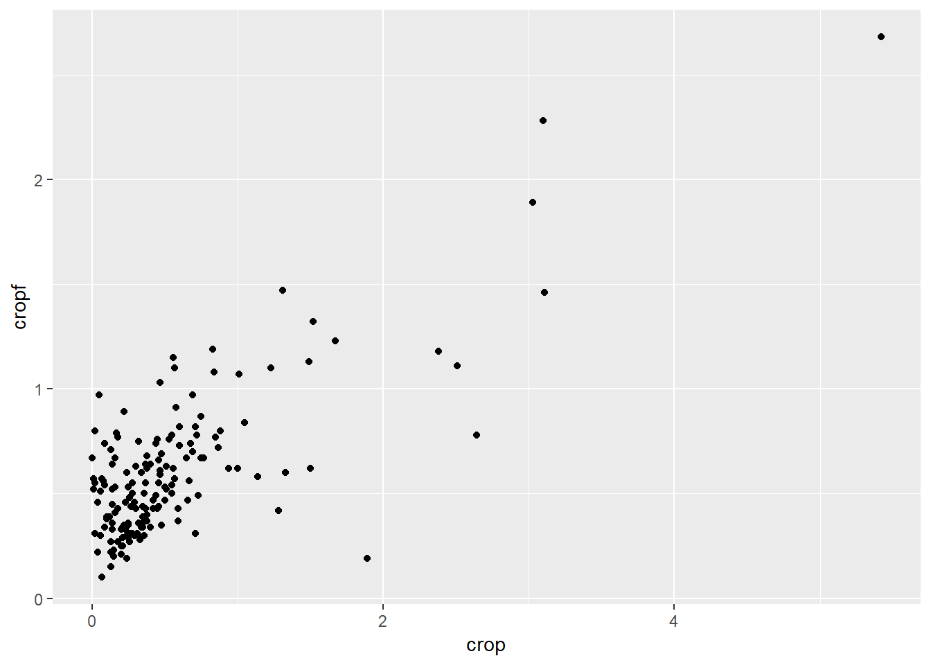
This figure is a little scrunched up so lets log the data and see what we get then:
ggplot(data = eco_foot) +
  geom_point(mapping = aes(x = log(crop), y = log(cropf)))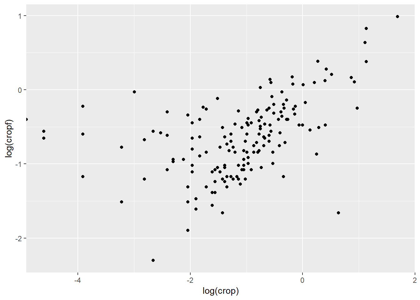
This plot reveals that as countries increase in total land cropped, their ecological footprint resulting from the cropping activities seems to increase as well. This basic plot includes important information such as axis labels. We can improve these and every other element on the plot later but first let us unpack what is going on. With ggplot2 we begin with ggplot() which creates a coordinate system to which we can add layers. The first argument of ggplot() is the dataset that we will use in the graph so ggplot(data = eco_foot) tells ggplot where to get the data from. But that is it - nothing more, nothing less. If we execut this code we will find that our graph is not very interesting in that form. To sort that out we need to add a layer onto this coordinate system - that is where geom_point() comes in. There are many “geoms” in ggplot2 and their job is to add data to your figure in layers using different data presentation styles. geom_point() adds data in a point (or scatter plot) manner. So ggplot now knows where to get the data from and what kind of graph to produce but it does not quite know what variables to plot and on which axes. That is what the mapping argument does. It tells ggplot how to “map” the data onto the graph coordinates. mapping is always paired with aes() and the x and y arguments of aes() specify which variables to map to the x and y axes of the figure. geom_... looks for the variables to map from the data argument in ggplot() which in our case happens to be the eco_foot data set.
A graphing template
So from this little description we can make a basic template of what each graph needs in it’s simplest form:
ggplot(data = <DATA>) +
  <GEOM_FUNCTION>(mapping = aes(<MAPPINGS>))
Our goal in this session is to understand and expand this template to achieve whatever graph we might want.
Quiz time
- What happens if you run
ggplot(data = eco_foot)?- Make a scatter plot of
log(crop)vslog(tbc).- Is a scatterplot of
tbcvsregionuseful? Why?
Aesthetic mappings
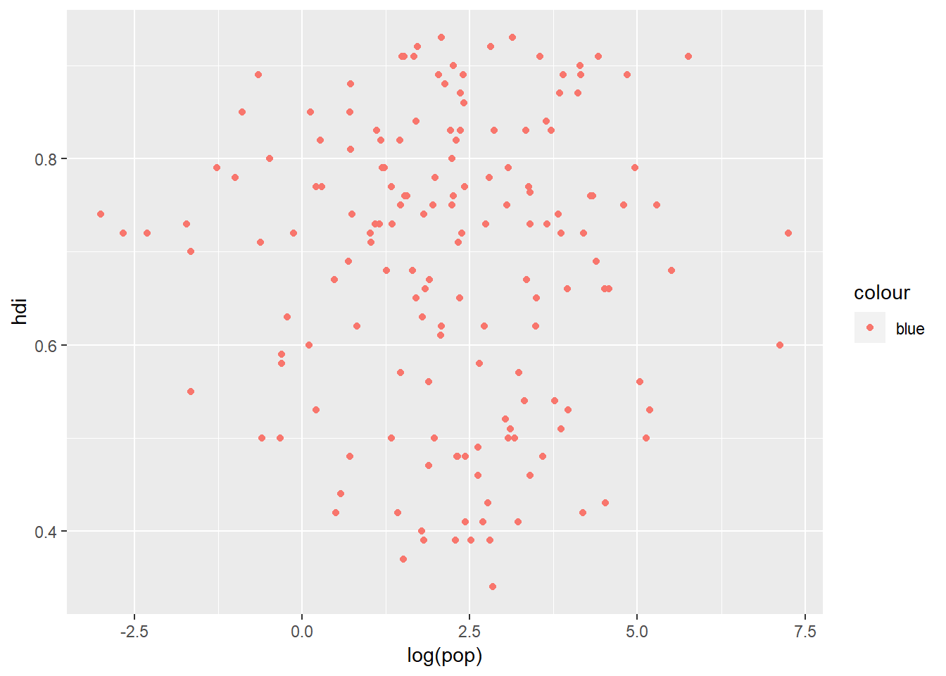
In the plot below there does not appear to be any real relationship between a country's population and the human development index but we know that there are some very big countries in specific regions of the world and there are some very destitute countries in other parts of the world:
ggplot(data = eco_foot) +
  geom_point(aes(x = log(pop), y = hdi))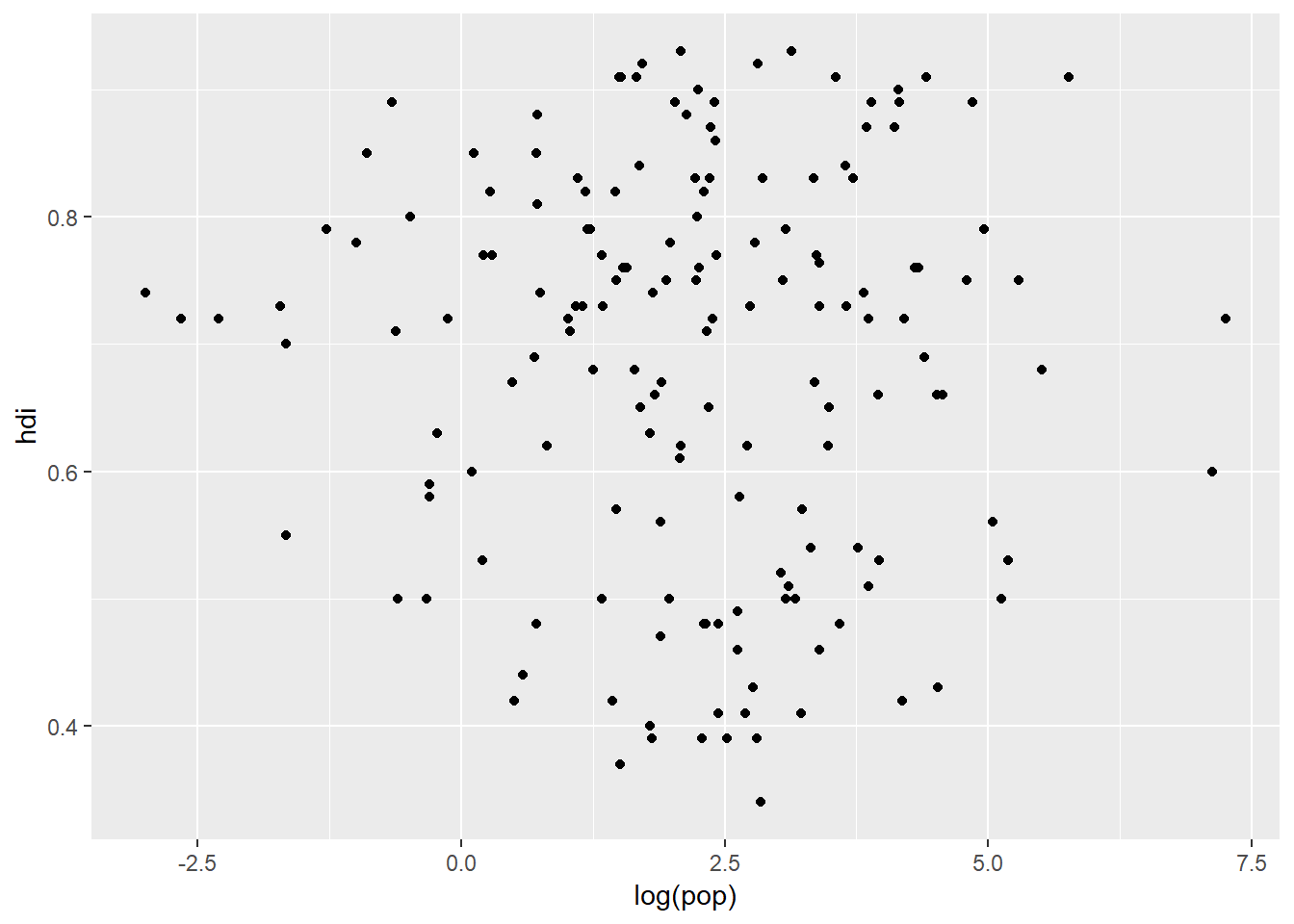
This simple plot does not really tell the viewer very much and we could be hiding some very important trends in the data. Our dataset contains a whole bunch of information within different variables and depending on the type of data a variable represents, we can choose different "aesthetics". Three simple aesthestics that we can plot are:
size- this handles continuous datashape- this handles categorical datacolour- this handles both categorical and continuous data
ggplot(data = eco_foot) +
  geom_point(aes(x = log(pop), y = hdi, colour = region))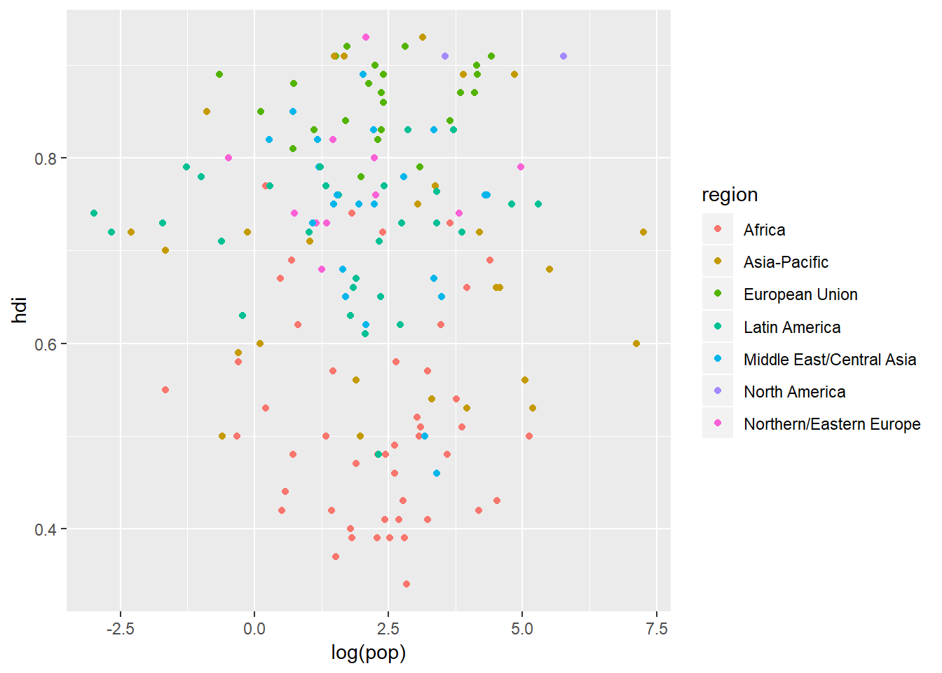
That is a bit of a better description for our reader. What is going on in the background here is that ggplot automatically assigns a level (if there is not one already assigned to our variable) in ascending order of alphanumeric starting characters. ggplot then adds a colour to each level from a “colour palette” and then prints out a neat legend to tell the reader what level each colour is representing.
In this example we logically chose to map colour to region but we could just as easily mapped size to region:
ggplot(data = eco_foot) +
  geom_point(aes(x = log(pop), y = hdi, size = region))
## Warning: Using size for a discrete variable is not advised.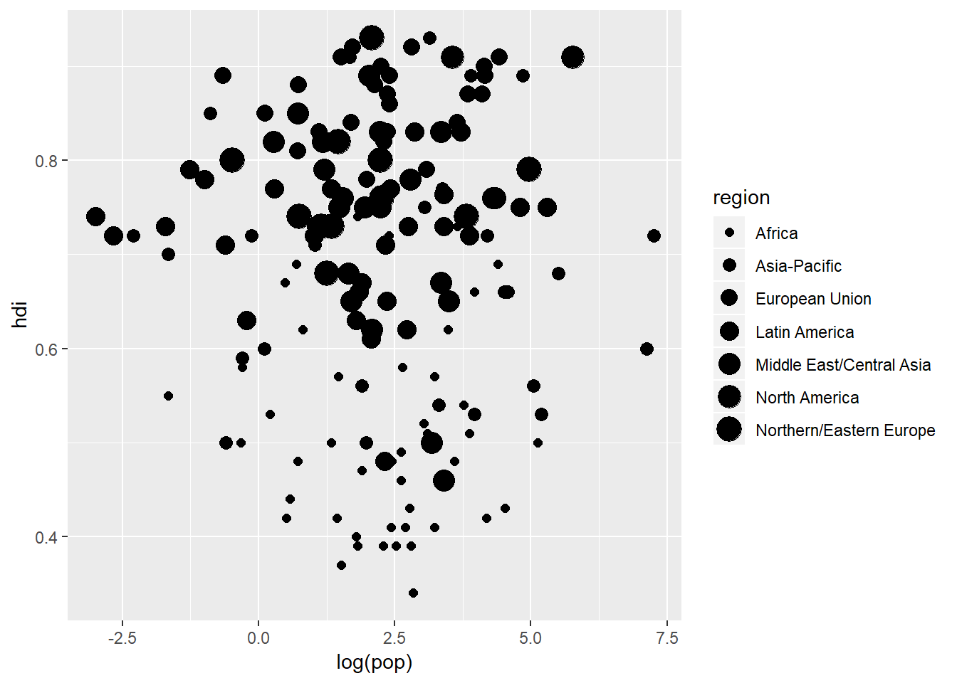
But notice the rather handy warning that ggplot prints out for us suggesting that mapping size to region is not a good idea because region is a discrete rather than continuous variable. A better option would be to map shape to region:
ggplot(data = eco_foot) +
  geom_point(aes(x = log(pop), y = hdi, shape = region))
## Warning: The shape palette can deal with a maximum of 6 discrete values
## because more than 6 becomes difficult to discriminate; you have 7.
## Consider specifying shapes manually if you must have them.## Warning: Removed 11 rows containing missing values (geom_point).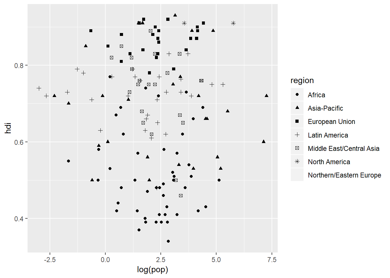
This is a little better but notice that there is now a different warning message. This time it is becuase there are too many categories within region and so it stops it at six categories because anthing more than that would become difficult for the viewer to discern between small, similar shapes.
Once you have mapped your aesthetics ggplot takes care of the rest - it automatically scales the axes and produces the legend. It selects reasonable axis tick mark intervals. But all of these can be overridden. For example, we can make the colour of our points purple:
ggplot(data = eco_foot) +
  geom_point(aes(x = log(pop), y = hdi), colour = "purple")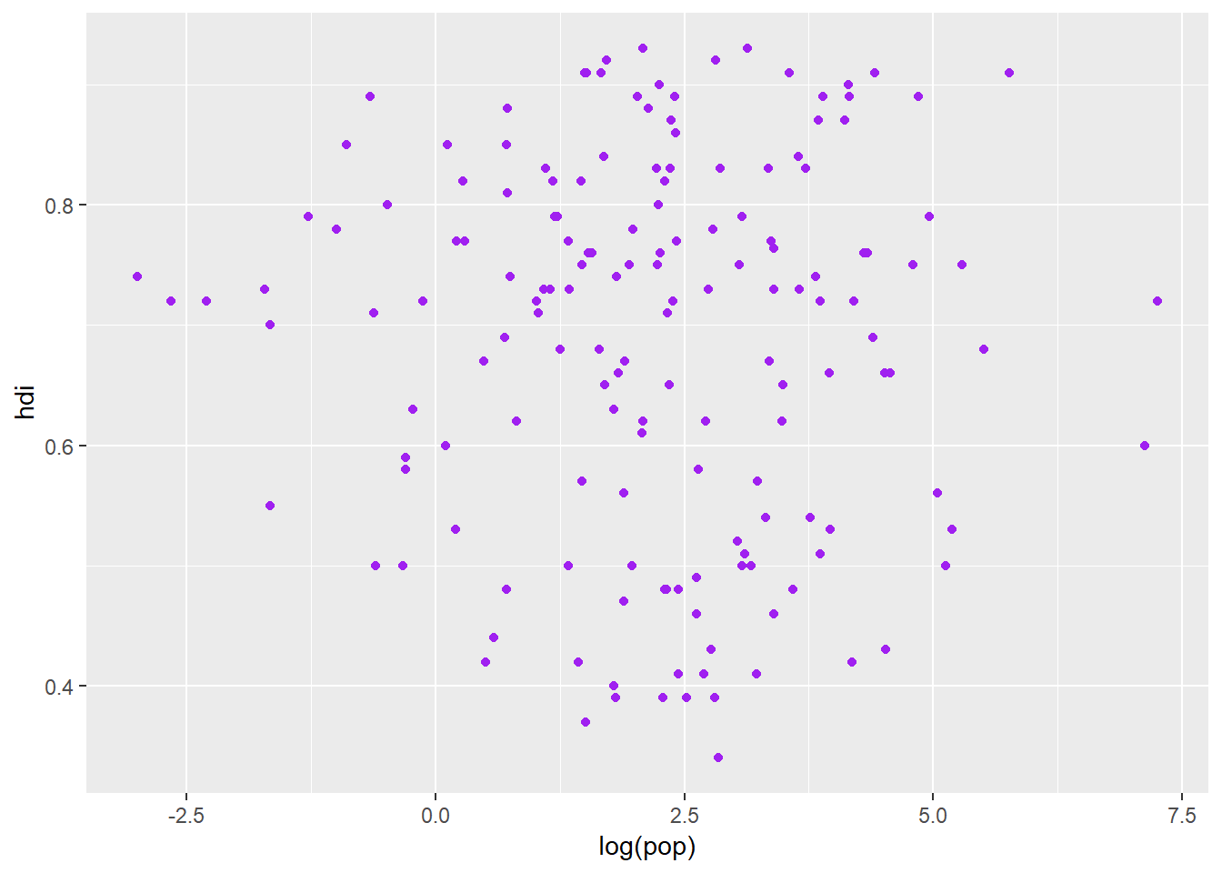
ggplot accepts a wide variety of general colour names so you will probably get the colour you want most of the time. You can also set the shape of the points:
ggplot(data = eco_foot) +
  geom_point(aes(x = log(pop), y = hdi), shape = 15)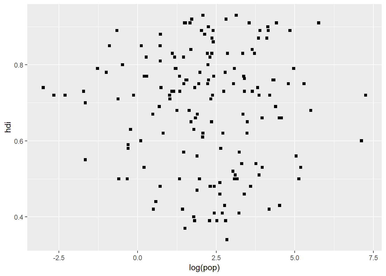
But here we, unfortunately, cannot write out “square”, we need to use a number which the shape is linked to. But also notice where the argument call goes in geom_point(). That is very important. colour = inside and colour = outside aes() are very different things.
Quiz time
- What is wrong with the following code:
ggplot(data = eco_foot) +
  geom_point(mapping = aes(x = log(pop), y = hdi, colour = "blue"))
- What happens if you map the same variable to multiple aesthetics?
- What does the stroke aesthetic do? What shapes does it work with? (Hint: use
?geom_point)
Common problems
Two common problems that you will likely run into with ggplot2 are the one addressed in question 1 above and then the + sign problem. When adding layers to your plot you need to put the + at the end of the line, not at the front. Also remember that when you get stuck you can always just type ?function_name to pull up the help file associated with the function. When error messages that you do not understand pop up you can also just copy those and Google - again keep a look out for websites like Stack Exchange and Cross Validated. Those are great forums to get help on a particular topic. The chances of being the only person who has had to deal with a problem are pretty slim.
Facets
One way to add extra infomation to your plots is through the aes() functionality. But another way which is useful for categorical variables is to split your plot into facets. Facets are subplots within a plot which each display a subset of the data based on its assigned category. There are two facetting functions:
facet_wrap()which takes a variable (~ x) and wraps the plots over a number of rows or columns. You can also indicate how many instances of the wrap occur along the x or y axis as well (see below).facet_grid()which takes two variables (y ~ x) and plots them on the y (columns) and x (rows) axes of the “meta-plot”.
ggplot(data = eco_foot) +
  geom_point(mapping = aes(x = log(pop), y = hdi)) +
  facet_wrap(~ region, nrow = 2)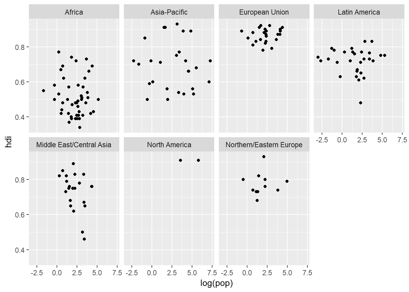
The ~ is an important character in R (and statistics in general). It means “is distributed by”. What we are essentially saying is that we want our facets to be distributed by region along the “x-axis” but then wrap this over two rows (nrow = 2). We could do the oposite:
ggplot(data = eco_foot) +
  geom_point(mapping = aes(x = log(pop), y = hdi)) +
  facet_wrap(~ region, ncol = 2)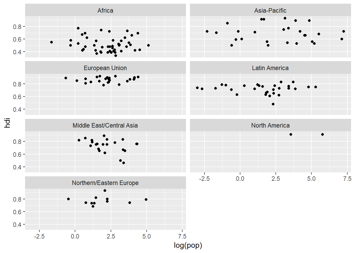
facet_grid() is very useful as well becuase it assigns specific variables to specific axes. When plotting one variable with facet_grid() we can produce a column of plots rather than rows of plots:
ggplot(data = eco_foot) +
  geom_point(mapping = aes(x = log(pop), y = hdi)) +
  facet_grid(region ~ .)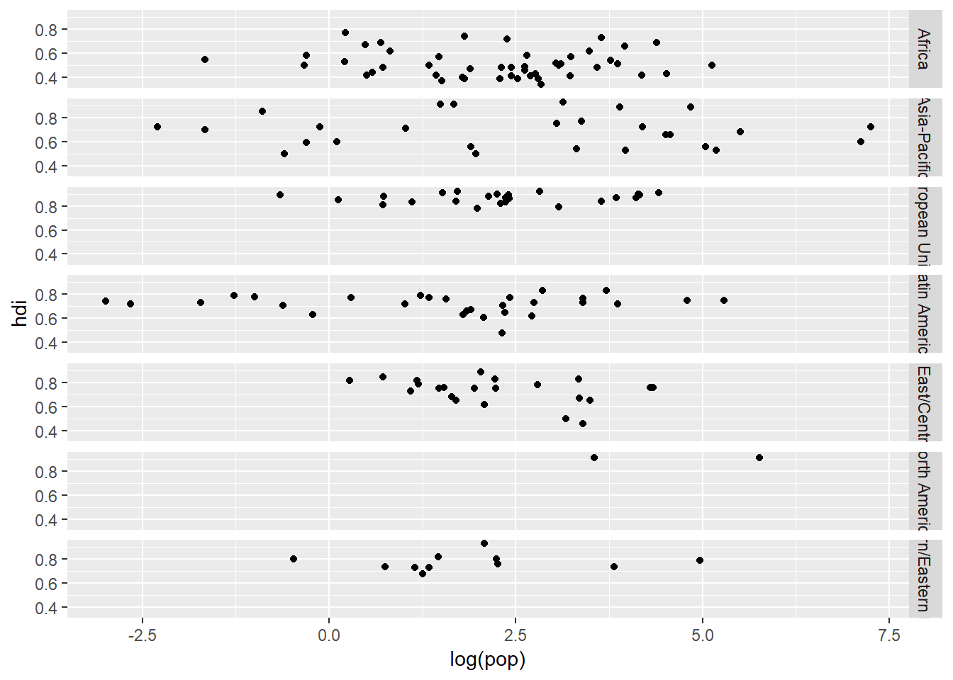
Or if we had another categorical variable we could make a plot matrix by replacing the . with the categorical variable in question. We need to have the . when we are only plotting one variable with facet_grid() because . is a place holder meaning “do noting on this axis”. Facets are a powerful tool to isolate data and see within variable trends more easily. But they can become distracting when you are facetting by many variables.
Geometric objects
How are these two plots similar?
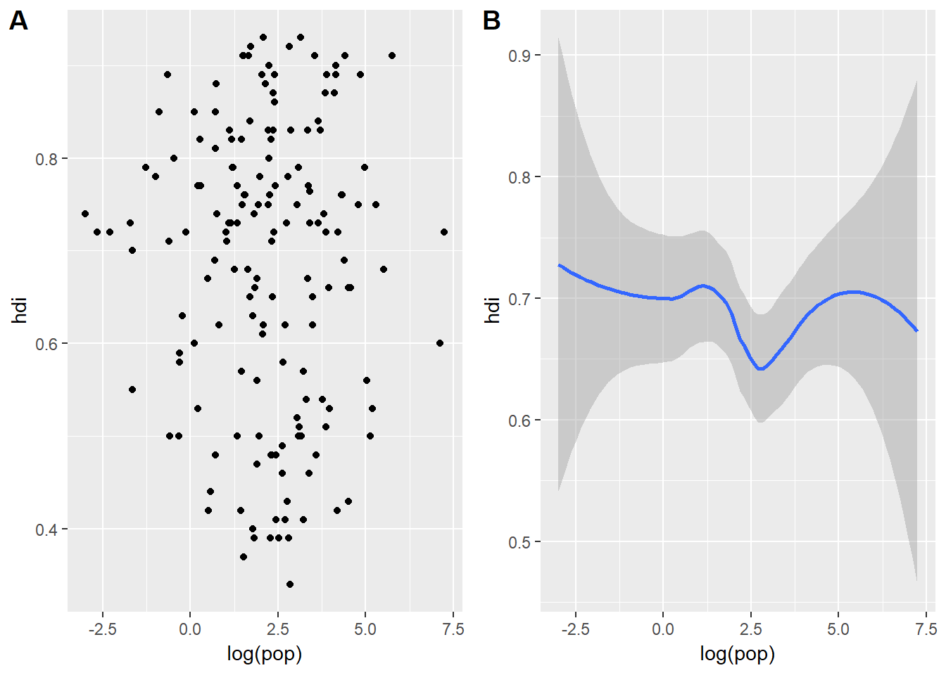
Both of them contain the same aesthetic mappings and both describe the same data but the plots are not identical. Each plot uses a different visual object to represent the data. In ggplot language we would say that the two plots are using different geoms.
A geom is the geometrical object which ggplot uses to represent the data. We can refer to the type of plot we want to make by the plot’s geom function. For example, bar charts use bar geoms, line charts use line geoms, and boxplots use, well, boxplot geoms. Scatterplots and regressions seem to breat this trend, they use point and smooth geoms. In order to change the way ggplot plots the figure all we need to do is geom_changeThisText(). So for the left figure I used geom_point() and for the one on the right I used geom_smooth().
Every geom function in ggplot2 takes a mapping function, however, these mapping functions might not be consistent across every geom. For example we could tell geom_smooth() to change the line type based on a particular categorical variable but we cannot tell geom_point() to change its line type - that would not make sense. Let us test it out with a geom_smooth():
ggplot(data = eco_foot) +
  geom_smooth(mapping = aes(x = log(pop), y = hdi, linetype = region), method = lm, se = FALSE)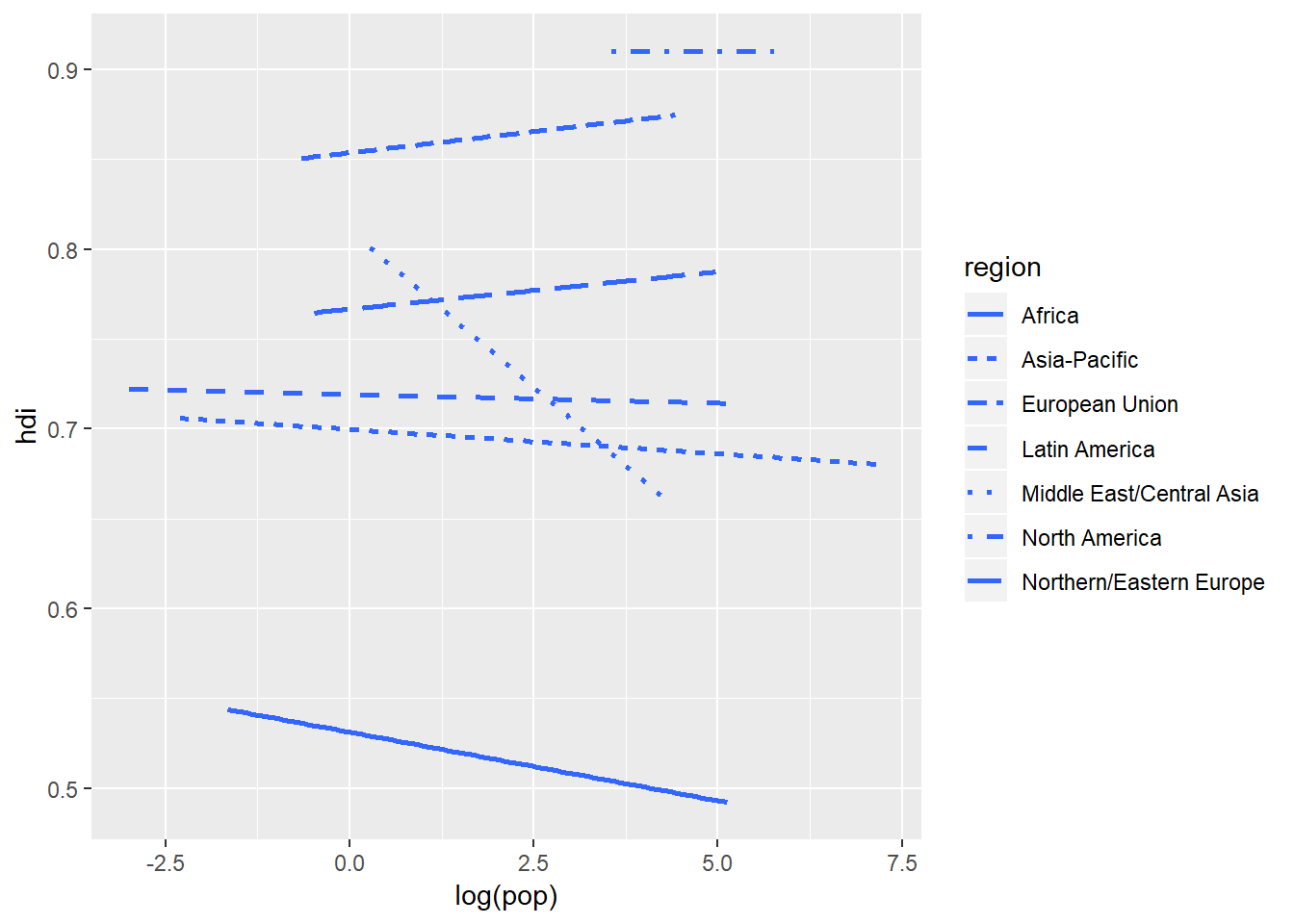
I have had to tweak the method and se arguments to make the figure a little more legible (I chaged the method from loess to lm which shifts the output from curved to straight lines. And then I removed the se (standard error band) by setting that argument to false to make patterns clearer). But removing the standard error band has taken away a key component of the data - the variation around the lines. We can reintroduce that by plotting the original data points using geom_point():
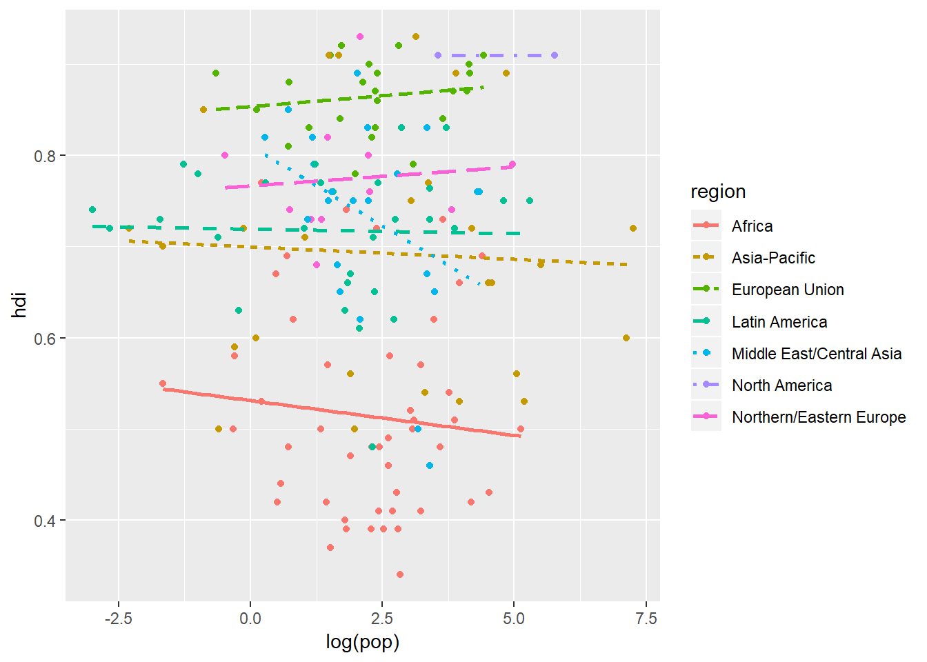
What we have just done is impressive! We have instantaneously plotted two geoms in one graph with a legend that is neatly and correctly formatted formatted. This would take quite a bit of time to do in other graphing software packages.
ggplot2 provides over 30 geoms and that is not including the unofficial ones. A good place to get an overview of the ggplot2 functions is the ggplot2 cheatsheet.
Now suppose you want to plot multiple geoms in the same figure, all you do is add these to ggplot() and then you are sorted:
ggplot(data = eco_foot) +
  geom_point(mapping = aes(x = log(pop), y = hdi)) +
  geom_smooth(mapping = aes(x = log(pop), y = hdi))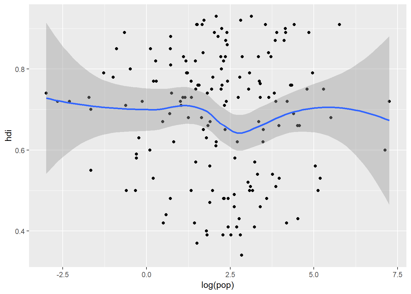
But writing this out can be quite repetitive, especially if there are multiple geoms plotting the same aesthetics. What’s worse is if you want to change the axes that we are plotting on you would need to make four changes to your code. A simple way to get around this is to pass a set of aesthetic mappings to the ggplot() call. ggplot2 will treat these mappings as global mappings which apply to each geom in your plot. In other words, this code will produce the same figure as the previous code:
ggplot(data = eco_foot, mapping = aes(x = log(pop), y = hdi)) +
  geom_point() +
  geom_smooth()
You can then add local mappings specific to a particular geom by including them within the aes() for that geom. This makes it possible to display different aesthetics in different layers:
ggplot(data = eco_foot, mapping = aes(x = log(pop), y = hdi)) +
  geom_point(mapping = aes(colour = region)) +
  geom_smooth()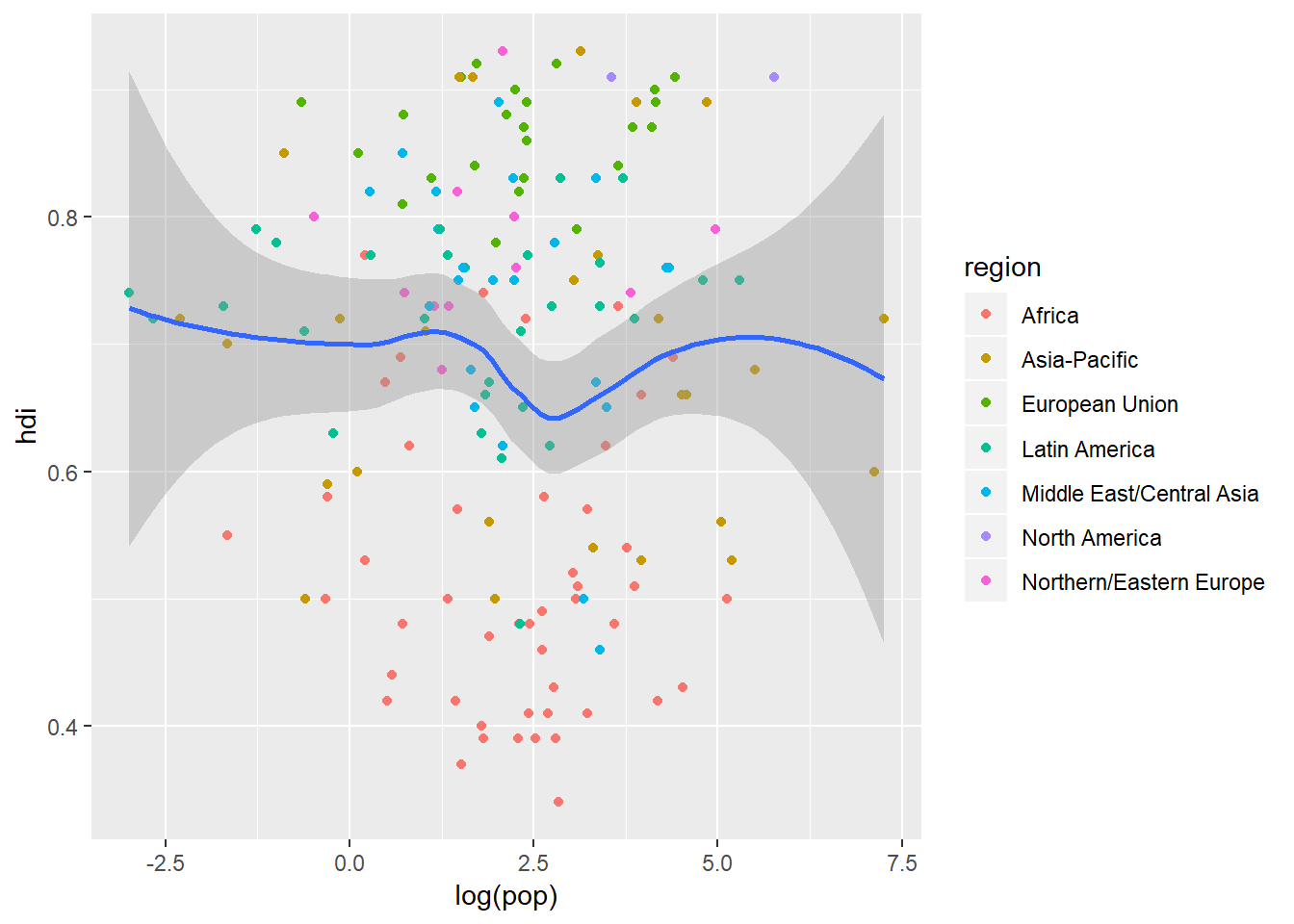
This can go another step further where different data sources can be used for different geoms. This next plot contains all the data in geom_point() but the regression line is only made up of Middle East and Central Asian countries which we can extract from eco_foot using filter() from dplyr all within the code behind the plot:
ggplot(data = eco_foot, mapping = aes(x = log(pop), y = hdi)) +
  geom_point(mapping = aes(colour = region)) +
  geom_smooth(data = filter(eco_foot, region == "Middle East/Central Asia"), method = lm, se = FALSE)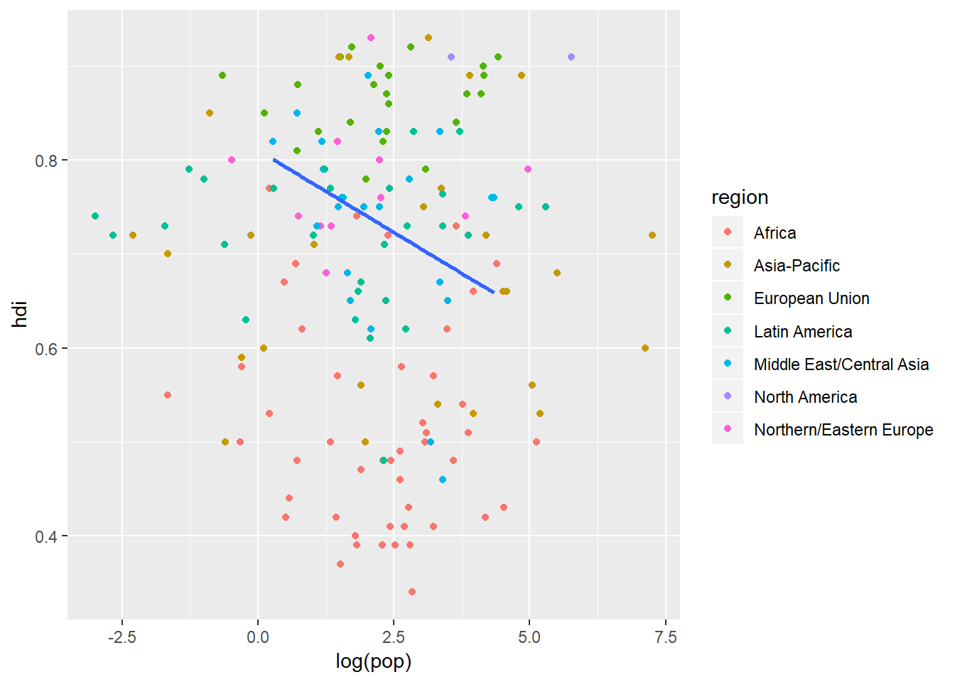
Position adjustments
One of the most dangerous things about graphs is that it is so easy to loose data underneath other data - a situation known as overplotting. This happens when there are many data points which have the same value so they just get put on top of one another - what looks like one data point might in fact be 20! This figure shows the relationship between the engine size of a car (displ) and the fuel efficiency at highway speeds (hwy). On the left is the figure with some serious overplotting and on the right is the same data but with a jitter adjustment assigned to the position of each point:
ggplot(data = mpg) +
  geom_point(mapping = aes(x = displ, y = hwy))

ggplot(data = mpg) +
  geom_point(mapping = aes(x = displ, y = hwy), position = "jitter")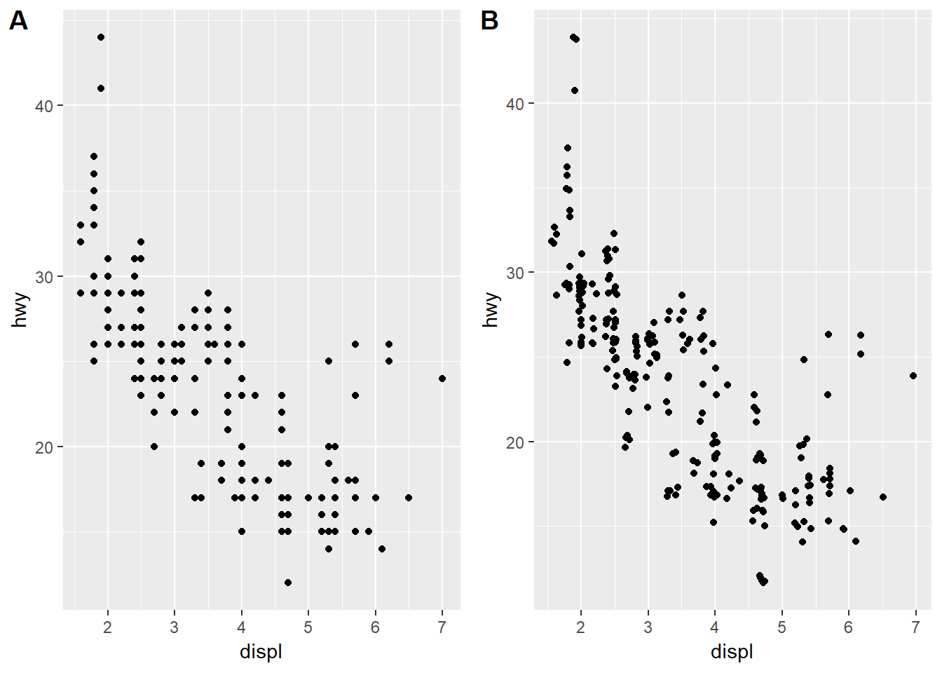
How this works is that the adjustment to the position argument tells the geom to add random noise to each of the points. You might gasp and say that you are distorting the data and yes, that is true. But you are only doing that at very tiny scales and in return you are getting much more data out of your plot. There are several other position adjustments that you can apply. Check out ?position_dodge, ?position_fill, ?position_identity, ?position_jitter, and ?position_stack to see how these all work.
There is obviously much much more to all of this but that is a fairly thorough introduction for now.
theme()
The figures you are producing are not the most glamourous - they are fine for exploratory analyses and rough working. Once we are happy with the basic plot we can then modify almost every aspect of the plot to get it ready to put into your thesis or manuscript using theme(). There are a couple of preset themes within ggplot2 - one you will find useful is probably theme_bw() which follows a black anad white colour scheme everywhere where you have not told ggplot to display colours:
ggplot(data = eco_foot, mapping = aes(x = log(pop), y = hdi)) +
  geom_point(mapping = aes(colour = region)) +
  geom_smooth(mapping = aes(linetype = region, colour = region), method = lm, se = FALSE) +
  theme_bw()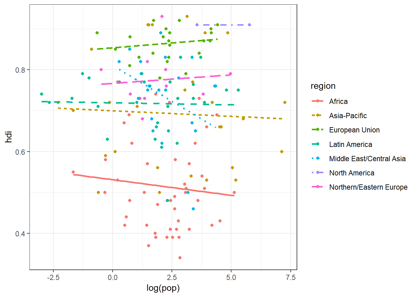
But if you want to be more specific then you can add a theme() layer to your ggplot. Within theme() you can change every aspect of the figure. The best way to see how would be to dive in and get started:
ggplot(data = eco_foot, mapping = aes(x = log(pop), y = hdi)) +
  geom_point(mapping = aes(colour = region)) +
  geom_smooth(mapping = aes(linetype = region, colour = region), method = lm, se = FALSE) +
  theme(panel.background = element_rect(fill = "white", colour = "black"),
        panel.grid = element_blank(),
        legend.key = element_blank(),
        axis.title = element_text(colour = "black", size = 11),
        axis.text = element_text(colour = "black", size = 10))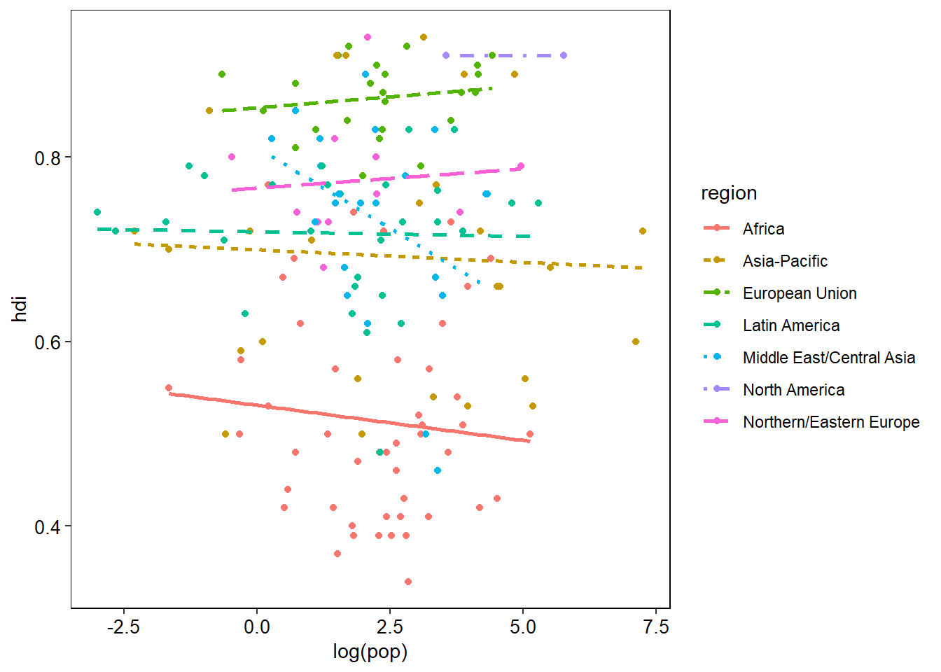
Things are looking much better now. Each aspect of the plot has a name which we can access from within theme(). Take the plot background for instance. That is called panel.background. Once we have identified the aspect of the plot to modify we then need to assign a set of properties to it using a desired function which contains the new parameters we want to apply. There are five function types (known as elements) that we can assign to the different plot aspects:
- element_rect - for rectangle type aspects.
- element_line - for line type aspects.
- element_text - for text and label type aspects.
- element_grob - I don’t really know…
- element_blank - removes the aspect from the plot.
Have a look at the above code and try understand why I have chosen those particular aspects. The next thing we will probably want to change are the plot's labels. Doing this is really simple with labs():
ggplot(data = eco_foot, mapping = aes(x = log(pop), y = hdi)) +
  geom_point(mapping = aes(colour = region)) +
  geom_smooth(mapping = aes(linetype = region, colour = region),
              method = lm,
              se = FALSE) +
  theme(panel.background = element_rect(fill = "white", colour = "black"),
        panel.grid = element_blank(),
        legend.key = element_blank(),
        axis.title = element_text(colour = "black", size = 11),
        axis.text = element_text(colour = "black", size = 10)) +
  labs(x = "Population (log scaled)",
       y = "Human development index",
       colour = "Geographic region",
       linetype = "Geographic region")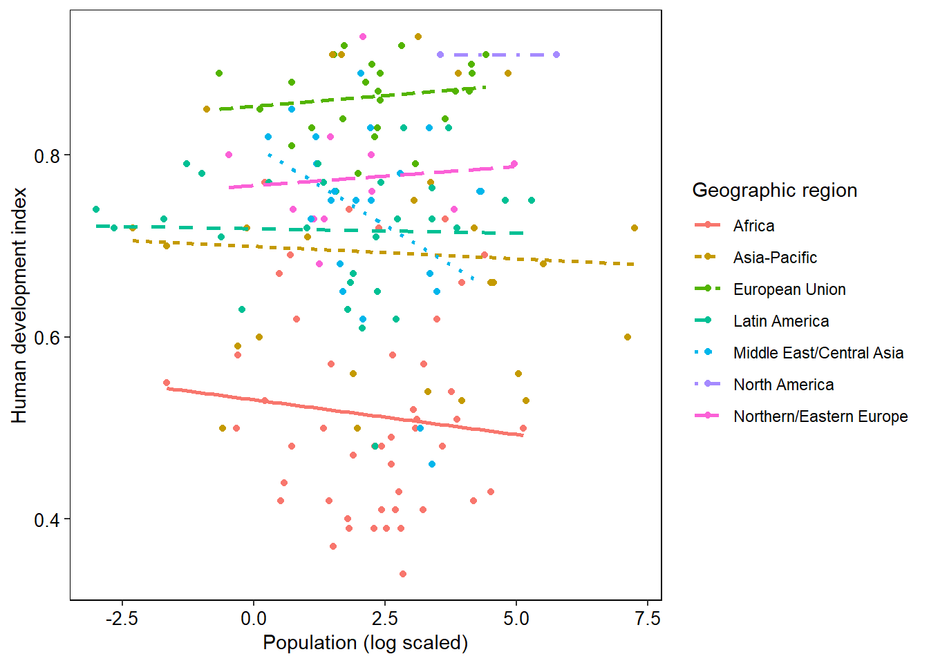
That is about all you would need to edit basic plots. There is a whole lot more that you can delve into with this - different colour schemes, multiple plots joined together, and in the next section, visualising your statistical outputs.